Thursday, 15 October 2009

Font/ Typography


The following fonts are ideas for my album cover. I have given out a separate questionnaire to find out which fonts would be most successful. Font number one is very clear and bold like, attracting the audience well and making the font easily read from a distance. Although at first glance I do think that the font is quite boring and lacks originality as I think the font should ensure that it gives off the genre of the music along with the keeping the idea of being in some one's imagination.


Font number 2 is similar to number 1, but there is a white border around the letters, making the letters seem close together. I think if this font was in a different colour would be very successful on the single cover as it would attract audience successfully because of its originality and that it is clear and concise.

Font number 3 is a stencil like font, this font is one of my favourites I think it's very artistic and the letters stand out well. With the background I am planning on having I think this particular font would go extremely well.

Font number 4 is a comical style type of font, this one is also one of my favourites I think if I use this one it will add into the idea of being in a child's mind, I took the inspiration of this font from Mika's 'boy who knew too much' CD cover which in my opinion I thought was very successful.

Font number 5 is very different from all the other fonts, the letters are very thin and together the band's name looks very old fashioned which perhaps would work to a disadvantage because the font doesn't give of the orginaityl and unquieness of the song and this is highlighted as the font was only given 5 votes by the audience.

Font number 6 is very similar to number 4, they both look comical and something that would appear in a children's comic. I think by using this particular font would be very successful, it is very big and chuncky being very eye catching.

Font number 7 is very big and wide, the font would be spread across the single cover, in the middle it has a white line making the shape of the letters, and the letters are quite curvy and rounded.

Font number 8, the letters are more close together and the style the words are in makes each letter look robotic, square like. I feel that if I perhaps use this font but in a brighter, warmer colour like red for example it will be eye catching and exciting.

This font number 9, each letter looks very thin and spaced out. The font is different from the others I have used the word altogether looks bigger and this will come to an advantage as the bigger the font, it is more likely that audience will notice it.

Font number 10, the last font is very much different from the others. The letters are all made out of small squares which altogether look very much exciting and visually attractive, however when I asked the target audience what genre they thought the font would be used for, the majority said dance genre so therefore as MGMT are not a dance band I will not use this font.

Monday, 5 October 2009

Friday, 2 October 2009

Animation

I am thinking of adding some animation to the finished film when editing, I have looked at 3D animation before once and feel it would enhance the idea of keeping it imaginative and enhance the idea of having a dream like atmosphere in the video.

I think by having hand drawn animation it will create a unique affect will be original to the film itself. The animation will also link in well with the imagination of the song. I will draw these myself, I will mainly draw mythical and fantasy creatures such as fairies and goblins this will be adding into the effect of illusion and fantasy's that will let the audiences mind roam free.

I have a software on my computer already that I will use, it is for 3D animation software that will enable me to make any digital models with any design that I have drawn on it. Examples of 3D animation has been used in many successful films like Toys Story, Shrek and Pocoyo. The advantage of using 3D animation rather than 2D is that 3D can create images that seem real the viewer whilst 2D appears like a cartoon and the techniques tend to focus on image manipulation. I can also use clay animation that uses figures in clay although I think by doing this I will achieve the look I want to in my film and it will be hard to manipulate how the clay looks with the actual film.

Many music videos have used animation in them and have proved to be successful. The main video which got my influence for using animation in my film was 'Go to sleep By Radiohead it featured 3D animation of a red rose swaying in the wind, and proceeds to show Thom Yorke sitting in a park bench singing the song while around him men and women walk by rapidly, towards the middle of the video the buildings suddenly start to crumble into pieces and moments later reassemble themselves, only to become modern in style. I particularly liked this video as it achieved everything revealing the narrative of the song and also the video is very unique and not another video with the artist lip syncing.


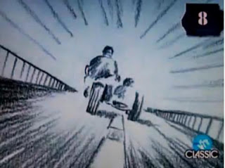
I have also got my inspriation from is the music video 'Take on me, By A-ha'. It features a pencil sketch animation/ live action, the video starts with a young girl reading a comic in a coffee shop, the comic contains a narrative about a motorcycle racing with a hero is pursed by two villians, the comic in the book winks at the girl. Then the graphical repr
esentation of a hand reaches out through the comic book and invites the girl into the animation world. I loved this idea of combining both worlds into one video, the video was very successful and won six awards in MTV video music awards.


Saturday, 19 September 2009

CD covers

I have decided to do a CD cover for MGMT and so I have been looking for inspiration from other bands of the same genre. Most of these album covers are done in the same style, of which I would like to incorporate on my CD cover. From my research I have found out that bands can make there CD covers look like whatever they like and it does not necessarily have to have a picture of the band and can be cartoons or any graphic images.


Kids in Glass Houses ,Blur, Coldplay


MGMT, Pink Floyd ,The Editors


In all these albums there is no actual image of the band or artist, I think this works very well because from my research I have found out that these sort of album covers are more rememberble and also perhaps have deeper, metaphorical meaning.

Magazine Adverts

This music advert is one I found in NME magazine, a music magazine associated with punk rock bands. It is for a single by Fall Out Boy, the focal image is of the band standing behind what seems to be some sort of machinery by looking up I can identify that they are standing behind a window. It is as if they are standing this way like they are hidden away and wanting to invite the audience to buy the single.After watching the video of this single, I found out that the band are making a statement similar to the statement they made in their video which was about the emo/punk rock scene and the competitive music industry.


The band members are all posing in different directions, showing that each individual member is different in their own style and personality, I think they are also standing this way showing their importance in the band for example the lead singer is standing right at the front.The lighting isn't very clear, so doesn't highlight their faces well, suggesting that the band have attittude similar to other rock/punk bands, they are represented as being a typical punk rock band standing solemnly.The font colour is white on a blue background, I think this matches well attracting the audience instantly which comes to a big advantage as people will be able to spot the advert easily when reading through a magazine.


The action line at the bottom which isn't in bold letters like the album title but can be seen clearly to give the audience information of where to purchase and download the single.


Kids in Glass Houses Magazine Advert


I found this magazine advert for Kids in Glass Houses particularly interesting, I thought this because it is very visually attractive. The font of green and red compliment each other well, the red looks quite stark. The white writing on the left hand side looks sophiscated and italic type title of 'Kids in Glass Houses' empotimises what a rock album should look like.


The main image focus is a red lolly with mouth titled open, the red is very bold and dominants the cover even though the only red is on the lolly and the womans nails, together they work extermely effectively as they constrast together well.


The album name is 'Smart Casual' the woman on the cover excudes but has a casualness of licking the lolly. The picture is an enlarged copy of their album cover making it easy for the audience to identify the album when wanting to buy it. The ratings at the top are always postive as they enhance the audience appeal, these ratings will enchance the audiences appeal as they are from well etablished rock magazines.
The advert is very bold and has vibrant, exciting colours that will attract the audiences attention.


Monday, 14 September 2009

Album cover analysis

We also need to make an album cover, the most important thing when making the CD cover is for it to be visually attractive for it to stand out and for people to buy it. I also have to ensure that the cover reflects the bands individuality but also the genre.

Album Cover analysis
This particular CD cover is very simple looking, and not very eye catching. The lettering is clearly displayed at the bottom right corner, it can be described as neat and simple perhaps even a bit boring. The dominant image within the front cover is of the star which connotes not only that she is the artist but also that her music may also be centred around her.

The physical appearance of the star is that she is well presented and her facial expression reveals that she is happy, this highlights that the music may also be centred around happiness. The colours are dominating lilac and white suggesting that the music may be very happy and lively genre and also shows her femininity.
In conclusion I think her Cascada's CD cover as a whole doesn't work too well, I believe that there should be more on the CD that would attract potential buyers, In my own CD I will try my hardest to make the cover visually attractive and unique.


Muse- Black holes and Revelations

This cover by Muse is from their third album, Black holes and Revelations. It clearly displays four bald men sitting at a table in a background which appears to be red and dusty. I think this is Mars, I can see it is the planet Mars from the background and how Mars has a distinctive 'red' colour.

This album cover is very different from others, although there isn't much on the cover it connotes onto another level, that the band are meaning to be metaphoric, this can reflect their personality's and perhaps is shown in their songs.

The font is clearly shown in the top left hand corner, in clear black lettering- this can be for many reasons, most importantly so that it can be seen easily by the audience but also connotes the band's individual brand name 'muse' and black holes and revelations being the albums name taken from one of their songs 'starlight' highlighting the bands imagination but also showing their personal reference.

The physical appearance of the men cannot be seen clearly but we can see that they are wearing quite strange, eccentric type clothes highlighting the genre of the songs and also their own personal individuality at the same time.

In conclusion, I personality think this particular album cover works very well, not only is it visually attractive it conveys the individuality of the band.

Mika- Boy who knew too much

The boy who knew too much by Mika is a very unique album cover, it features a lot of graphic images inspired by a pop art style. On the right hand side we can see a picture of the artist,this is very strange as many artists have a whole image of them dominating the cover,on this cover we can only see a small image of him suggesting that his music may not all be about him and the rest of the cover is much more dominating,instantly attracting the attention of the audience. The images are painted from bright and vibrant colours,the pictures on the front are illustrated interpretations of each one of his songs which cannot be said of other artists as this can be very difficult to do. The album name 'the boy who knew too much' may be a reflection of him and his album suggesting that he perhaps knows too much and everything is confusing and mystifying and thrown onto the cover. The album is similar to his debut album which also features cartoon images of this kind which is good as it lets us as an audience to identify it as mika's album.In conclusion I think that Mika's album is one of the my favourite, not only is it easy to make, its visually attractive and attracts the audience because of its unique quality. The distinct style of drawing would also target different kinds of people reflecting his type of music.


Story of the year- in the wake of determination


This album by story of the year is very different from the other albums I have analysed, as it doesn't actually have a dominant image on or does it feature a picture of the band and only a title of album and the band's name and no prominent art work on the front. However there is a background art, from first glance this image looks like water and green paint being thrown at the album to make a nice combination of the two colours, but when I looked closer I realised it was a dragonfly being killed portraying violence and also the violence in their lyrics. I think the front cover is also very harsh showing the harshness that is in life. The albums font also matches the colour of the dragonfly's blood contrasting both of the colours together.


In conclusion I believe this album cover is quite successful because from the visuals shows the story of the music and the type of music the band makes only from the album art.

The Beatles- Abbey road


Abbey road was an album released by The Beatles, it was the last album of theirs.The whole idea of the image is that Paul McCartney is dead, also suggesting in a song called 'Paul is dead' and other hidden lyrics in their songs.


The physical appearance of the band members is distinctively unusual, John Lennon is dressed all in white, similar to a clergyman or maybe a 'god' like being. Ringo starr is wearing a black suit representing an undertaker. Paul Mccartney wears a black suit and walks out of the step with the other beatles, it is common for people to be buried with no shoes on, and Paul is wearing no shoes, revealing that he is a ghost or he is in fact dead. Right in the background we can see a hearse and it looks like they are walking towards it.


In conclusion I think this cover is very successful and is it my favourite as it tells a story, at first glance it just looks like 4 men crossing on a zebra crossing but after looking at for longer time the story is revealed.


I think its use of hidden messages is very clever although takes a lot of thinking to work out, it also features all members of the band showing the audience whose album it is. The idea that Paul McCartney is dead was a publicity stunt carried out by The Beatles and so supported this cover, the idea of Paul wearing the white outfit and the Hearse in the background made the audience think Paul was dead, adding a surreal effect. I think if a person doesn't understand the dominant image on the CD cover then its not very successful, because it doesnt have anything to offer the people who can't see the hidden message or who aren't actually Beatles fan. Although I do belive that the cover is successful when targeting fans of The Beatles, but not very when attracting new fans.