Saturday, 5 December 2009

Possible Magazine Adverts

For designing the magazine adverts, obviously I would like to stay in with the theme of 'imaginative' ideas, for this advert I wanted to add in a aspect of originality as well. I drew a series of shapes and graffiti like drawings on paint software. I decided to do swirly patterns and lines of different colours to portray the influence of the simulation of a person's imagination, and the idea of being inside someones head, the idea of imagination taking control through music, which I think in particular MGMT's time to pretend song does.
I also believe that having the artists on magazine advert is essential, as the audience looking through a magazine have to be able to recognise what band the advert is about, the first band member is placed on the bottom left hand corner., I took this image from the bands actual video from 'time to pretend' because Andrew James VanWyngarden is acting particularly imaginative and 'random' in this video by holding a bow and arrow it seems as if he is shooting at the other band member Ben David-Martin Goldwasser as if they are against each other, making the advert more interesting to appeal to the audience. The other band members image is placed on the right hand side, He is looking peaceful and calm perhaps revealing that the songs on the album are calm, chilling out songs. I also liked his outfit in this picture as it is white it may sort of portray an angel like figure and something that is dominating.
I think having the band members together would not be 'original' and this way the band members should portray there own individuality and personality.
The centre of the image I decided to get a picture of eyes in the middle, I feel that this is particularly striking when a person looks at it first, and when the audience look at the magazine advert the eyes will in a sense catch there eye first it also looks like eye is staring right at us giving an almost surreal effect.
The font used is the same one that I have decided on using in all of the magazine adverts for MGMT. I have placed the writing on the top right hand side on the advert because I felt this was the best place for the font to be most eye catching in this place, I put the album name in the middle of the advert in prominently white font with a black background, this font however is different from MGMT's name as it is smaller and a different style of writing, I liked this font as each letter was different from each other giving the whole word interesting, and graffiti like style.
I thought by having a cartoon devil it would add an aspect of being powerful and personifying evil and supernatural rebellious figure. Opposite the devil there is a fairy, another legendary
creature described as supernatural as well. I feel that MGMT's time to pretend album is a lot to do with this, the idea of escaping from the 'norm' into your imagination.
Overall I think the album cover can describe the bands music well, along with being eye catching. However after looking at the advert after some time I don't think it looks professional enough for an magazine advertisement, although it does fit in with the abstract, hippy image of the album looking at it, it looks easy to make unlike professional magazine adverts.


This is the second magazine advert I designed, I prefer this one to my first I believe it is much more eye catching and although it has more images on as the first advert I have limited the images so that when the audience look at the advert there will not be too much chaos on the page.
I have used a number of 'random, hippy' images to match in with the lyrics and meaning of mgmt's song, I have tried to keep happy bright colourful images on the page as well ,in hope that the happiness of the images will have an affect on the audience.
The font I have made myself from an image from a plasma ball and I have cut out the letters to make it, I think the idea of having the font in the middle would attract the audience to the advert but would also give the audience with something to identify to the band.

The font at the bottom 'time to pretend' I also made and cut the font myself, I wanted to keep it fairly simple so that the fans can see it straight away, I have also cut it out this way on purpose I think it looks almost childlike and doesn't look overcomplicated. The 'Out Now' font I have decided to keep this yellow in contrast with the green so it will stand out as an advert, the colour yellow also suggests happiness giving off a happy mood. I cut the faces of the bands heads from a photo of them, I chose this image of them because they looked deep in thought and also because I felt black and white was a good effect with weird, colourful images on top of them. The reason for using so many cartoon, animal photos as the song 'time to pretend' mentions animals in the lyrics a lot of times and also the idea of having animals matches in with the theme of letting the mind roam free and fantasy like.

Overall I think the advert is attention grabbing and thought provoking, I think it looks weird but weird in a good way. The number of strange images also attract a wide target audience from children to adults. I think the whole advert reflects fun and happiness and reminds us of childhood and about acting immature this is the reason I have placed a lot of cartoon images and smile images around the page suggesting to the audience that their music is most likely about this. I also liked designing the advert in this way because it is very different and unique from most music adverts I have researched and is not all just about a clique photo shoot of the band.
I think MGMT's song is about escaping from reality and going into your imagination which is the image I'm trying to create and I believe this advert achieves this.


This advert is the last one I have designed, firstly I started off by spalshing paint and using paint tools to create a random effect of pure emotion and craziness, similar to advert number one that is graffiti like. I then placed images of cartoon animals, random objects around the advert to create an effect of being in someones mind and the idea of imgantion taking over in a person's life.
On the left hand side Ive pasted images of money a few times to highlight that celebrities are obesssed with money and the famous lifestyle of being a celebrity, here I have created a sense of irony having the money on the advert.
The first band member was placed in the middle it is from MGMT's photoshoot, I picked this particular picture because of the design on chest and his arms, then on the outside I highlighted the outside of where he was standing by using the paint software airbrush tool. The second member of the band is standing on his right hand side, I didnt want both the members to be standing next to each other so it was like a 'normal' photoshoot


This is the very last magazine advert I have designed, I believe it has the most potential and is the most visually attractive advertisement. I think it conveys exactly what the song is about ( images of animals, childhood) and it is also keeping in with the image that MGMT has of a hippy, psychedelic image.

Thursday, 26 November 2009

Interview with Chipmunk Marketing manager

We thought it would be helpful if we got some advice before designing marketing ideas such as posters to talk to someone who could give us some tips of what to do to make a successful CD cover and magazine advert. At first we decided we might interview MGMT's marketing manager as this would be perfect to get inspiration and help from, however the manager from the band was not available and we decided to ask the marketing manager for chipmunk , who is a solo grime artist although he is not the same genre as MGMT, we thought it would be helpful to get some advice on marketing an artist and how to successfully portray the image and music.
Lily asked her dad who works in Sony Bmg to set us up an interview for a few hours so we could get advice from Chipmunk's manager.


1. When you first sign an artist, how would you begin to market them?

Firstly, I would sit down with the artist so I can get to know them and their interests and it gives them a chance to get to know me, and this is very important because for a long period of time we will be spending many hours together. I then proceed to sit down with the Artist and Repertoire (A&R) man to see what he thought when he recommended them to the label. I make sure I know what the artist is about, the genre they are planning on moving into, their image, their idea of a target and some more of their plans to get themselves to the tops of the charts, for example, when I worked with the Ting Tings they told me they wanted to be seen as a D.I.Y sort of band, they wanted an original idea and not just to be seen as a stereotypical Hollywood type band.


2) How do you decided on the image of the band?


Again, this depends entirely on sitting down with artist, getting to know them, getting to know their interests and understanding how they would like to come across to their audience. At the moment I am working with Chipmunk (Chip), he was very clear about what he wanted his image to be, so then that was our job to make it happen. We do not decide everything, the artist themselves are pretty much the backbone to our job. Chipmunk's image and audience is basically him. His age group, his music interests, his styles, etc.MGMT were not as obvious as Chip as to who they wanted to appeal to and what they wanted their image to be. It took much longer with a group like them because their image can appeal to many different genres. However, we need to make sure the genres are specified and not just a general outlook, so from then on we have a good idea on what the album covers, advertisements and music videos will look like.


3. Do you decide on the target audience?


As a marketing manager I do have an important role when deciding on the target audience for a band. However, in the past 12 - 18 months, there has been a new area introduced to Sony which specifies in the decision of the target audience for an artist. When MGMT first started out, they would have been aimed at a group in society called the fanatics, people who go out of their way to find out the new music. Suddenly a radio D-G heard of them and played them on Radio 1 then they got heard by millions of people and this is what got them to the height in the charts that they are at at the moment. When marketing MGMT we had to come up with suitable places to advertise them. For example, if we were to dedicate a whole page to them in Sugar magazine, we will probably not get the response we need. However, if we were to advertise them in a magazine like NME for example, they would stand more of a chance because of the people who read the magazines and the people who like their style of music.


4. How are you involved in the making of the music video?


I am very heavily involved in the making of the music video. Me and my team begin by listening to the song that we are making the video for then continue to have meetings and produce a long list of features to put in the video. We run these by the A&R man, seeing his opinions on them, how effective they will be in comparison to the song and how easy or difficult it may be to stay within the budget of the video. We then tell the artist our ideas, hear their feedback and work on any changes they would like to make. We all make up storyboards which we rely on very heavily. I am there most of the time during filming to make sure the process is running smoothly and to plan.


5. How important do you think the music videos are to marketing and image of the band?

The importance of a music video definitely varies with the artist and the song choice. For example, MGMT's music videos are relatively important because it is the most effective and easiest way to portray the bands trippy or hippy sort of image. The importance of the video is also to do with the target audience of the artist. MGMT are aimed at a younger generation who are mostly very involved with technology, and rely on the TV to see the new music videos and singles. On the other hand, an artist like Harry Connick Junior, who aims at an older group of people because of the genre of his music and other aspects to him, like his roles in films etc. Somebody like this does not rely so much on a big budget, amazing music video because his fans are most likely older and rely on technology much less than the fans of MGMT.


6. In a band, is it important to give the separate members different identities?


This is a different marketing plan. The Spice Girls did this and it was one of the things that people could relate to with the band. It is mainly about whether the artist wants to or not. The Spice Girls were most successful going down this route because it was something new and different to anyone else around at the time, it also suited their genre. A band like Kings of Leon, for example, will not need this sort of plan because the people who listen to their music are not obsessed with what they look like, or what their names are, the majority of Kings of Leon's listeners become fans with them purely because of the sound of the music they produce.


7. What form of advertising is the most successful?

Whatever advertising we choose to do for the artist it is key to making the band successful, from bus stop posters to glamorous TV appearances. An appearance on a TV show like the X Factor would allow any artist to boost up in the charts. Even when Daniel Merriweather's song Red was played as background music it suddenly had about 10 times more buyers than it had done the previous week. This is a very hard question which, again, ultimately depends on the artist.


8. When making a music video what are the more challenging aspects and what are the easier aspects?

The whole process is constantly up and down on the scale of how easy or difficult it may be. The whole thing can be challenging or the whole thing can run smoothly. I would say that the hardest thing during the making of a professional music video is staying in the budget. It almost never happens. If we begin with a budget of £50,000 the overall price will end up being at least £55,000. After coming up with extravagant and amazing ideas it's not surprising that it can be hard to keep within the price limit.


9. What makes a successful magazine advert?

A bright, bold, simple idea. Something that stands out from the page when somebody is flicking through a magazine, as the majority of people do not spend time reading the advertisements in full detail. Once you have caught the reader's attention they will read it, but there needs to be something vibrant to catch their attention in the first place.


10. What makes a successful CD cover? E.g. Something original or something the audience can relate to.
Again this varies on the artist and buyer. It is difficult to determine whether a good album cover is one that has sold 3 million copies or one that has an amazing design but may not have sold as many. There needs to be something that buyer can see that links to the artist, for example, a logo, photo or phrase. Chipmunk's album cover to the album, 'I am Chipmunk', I found very off putting, I didn't like it at all, however, Chipmunk himself loved it and so did his target audience because that's who it is targeted at, so that is who will like it. Another good example of an album cover is ACDC. They always have the same band logo, with the bold red writing and the lightning bolt striking through the middle of the letters. Fans will be able to see straight away that it is definitely the right album and artist. People who may not have heard of them before would still be able to tell what genre they are and who they would be aiming at because of the photos and the logo. It is a very simple design, but at the same time, an extremely successful and recognisable one.


11. How much do you rely on technology, how useful do you think it is?


Technology is a vital part of the music industry, so much so, that record companies would find it extremely difficult to survive without it. It has progressed so much from 30 years ago, and everyone has adapted and now relies on it a great deal. A lot of what we do would not be possible without the great standards of technology that we are able to get a hold of, from being able to produce incredible effects in a music video to funky and eye catching images on a poster.

Wednesday, 18 November 2009

Possible CD Covers

Below are some possible CD covers I have designed them to fit in with the bands image and to match with the song, and the songs that will be on their album.
I think album covers that are original have a lasting effect on the audience and are most visually attractive, therefore attracting audience into buying their album. So I have decided to do something original but also something that will match to there songs, but I also wanted to try and keep it fairly simple and simplicity attracts attention and will be eye catching.

This is one I have designed on Photo plus and Paint software, the cover is made up of a series of photographs and drawings to create a fantasy/ random effect. The whole of the cover is meant to portray imagination and the idea of 'pretending' and keeping the idea of child like behaviour.
I used lots of bright and vibrant coloured images to catch the audiences eye and to also create a happy mood by looking at it. I have collage lots of different, random images of all kinds of people and objects, such as flowers,animals, cartoon pictures and children.
The background for this cover its imaginative and a childlike atmosphere, the narrative im trying to protray with this cover is a hippy image as this is MGMTs look.


After designing some CD covers I will narrow them down to a few and ask some of the target audience to decide on which one they like the best. I am designing them on paint, and a few I have decided to draw myself, I want to keep in the theme of imagination and fantasy.


This cover is made up of a photograph of MGMT that I have traced the picture of them out on photo plus software, I then copied the drawing out in a black colour. Although I do like this CD cover I don't think it matches with their songs as well as their image as well. At first glance it seems boring and they do not appear to be indie singers,after asking students in my year what they thought of this CD cover, although a lot of them liked the way it was designed many people agreed that it did not match well with the genre of the music or MGMT's image. One person said thought the band looked like a folk singers, so therefore I will not be using this particular CD cover although I may use some of software for designed the art work.

Thursday, 15 October 2009

Font/ Typography


The following fonts are ideas for my album cover. I have given out a separate questionnaire to find out which fonts would be most successful. Font number one is very clear and bold like, attracting the audience well and making the font easily read from a distance. Although at first glance I do think that the font is quite boring and lacks originality as I think the font should ensure that it gives off the genre of the music along with the keeping the idea of being in some one's imagination.


Font number 2 is similar to number 1, but there is a white border around the letters, making the letters seem close together. I think if this font was in a different colour would be very successful on the single cover as it would attract audience successfully because of its originality and that it is clear and concise.

Font number 3 is a stencil like font, this font is one of my favourites I think it's very artistic and the letters stand out well. With the background I am planning on having I think this particular font would go extremely well.

Font number 4 is a comical style type of font, this one is also one of my favourites I think if I use this one it will add into the idea of being in a child's mind, I took the inspiration of this font from Mika's 'boy who knew too much' CD cover which in my opinion I thought was very successful.

Font number 5 is very different from all the other fonts, the letters are very thin and together the band's name looks very old fashioned which perhaps would work to a disadvantage because the font doesn't give of the orginaityl and unquieness of the song and this is highlighted as the font was only given 5 votes by the audience.

Font number 6 is very similar to number 4, they both look comical and something that would appear in a children's comic. I think by using this particular font would be very successful, it is very big and chuncky being very eye catching.

Font number 7 is very big and wide, the font would be spread across the single cover, in the middle it has a white line making the shape of the letters, and the letters are quite curvy and rounded.

Font number 8, the letters are more close together and the style the words are in makes each letter look robotic, square like. I feel that if I perhaps use this font but in a brighter, warmer colour like red for example it will be eye catching and exciting.

This font number 9, each letter looks very thin and spaced out. The font is different from the others I have used the word altogether looks bigger and this will come to an advantage as the bigger the font, it is more likely that audience will notice it.

Font number 10, the last font is very much different from the others. The letters are all made out of small squares which altogether look very much exciting and visually attractive, however when I asked the target audience what genre they thought the font would be used for, the majority said dance genre so therefore as MGMT are not a dance band I will not use this font.

Monday, 5 October 2009

Friday, 2 October 2009

Animation

I am thinking of adding some animation to the finished film when editing, I have looked at 3D animation before once and feel it would enhance the idea of keeping it imaginative and enhance the idea of having a dream like atmosphere in the video.

I think by having hand drawn animation it will create a unique affect will be original to the film itself. The animation will also link in well with the imagination of the song. I will draw these myself, I will mainly draw mythical and fantasy creatures such as fairies and goblins this will be adding into the effect of illusion and fantasy's that will let the audiences mind roam free.

I have a software on my computer already that I will use, it is for 3D animation software that will enable me to make any digital models with any design that I have drawn on it. Examples of 3D animation has been used in many successful films like Toys Story, Shrek and Pocoyo. The advantage of using 3D animation rather than 2D is that 3D can create images that seem real the viewer whilst 2D appears like a cartoon and the techniques tend to focus on image manipulation. I can also use clay animation that uses figures in clay although I think by doing this I will achieve the look I want to in my film and it will be hard to manipulate how the clay looks with the actual film.

Many music videos have used animation in them and have proved to be successful. The main video which got my influence for using animation in my film was 'Go to sleep By Radiohead it featured 3D animation of a red rose swaying in the wind, and proceeds to show Thom Yorke sitting in a park bench singing the song while around him men and women walk by rapidly, towards the middle of the video the buildings suddenly start to crumble into pieces and moments later reassemble themselves, only to become modern in style. I particularly liked this video as it achieved everything revealing the narrative of the song and also the video is very unique and not another video with the artist lip syncing.


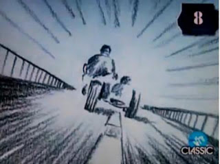
I have also got my inspriation from is the music video 'Take on me, By A-ha'. It features a pencil sketch animation/ live action, the video starts with a young girl reading a comic in a coffee shop, the comic contains a narrative about a motorcycle racing with a hero is pursed by two villians, the comic in the book winks at the girl. Then the graphical repr
esentation of a hand reaches out through the comic book and invites the girl into the animation world. I loved this idea of combining both worlds into one video, the video was very successful and won six awards in MTV video music awards.


Saturday, 19 September 2009

CD covers

I have decided to do a CD cover for MGMT and so I have been looking for inspiration from other bands of the same genre. Most of these album covers are done in the same style, of which I would like to incorporate on my CD cover. From my research I have found out that bands can make there CD covers look like whatever they like and it does not necessarily have to have a picture of the band and can be cartoons or any graphic images.


Kids in Glass Houses ,Blur, Coldplay


MGMT, Pink Floyd ,The Editors


In all these albums there is no actual image of the band or artist, I think this works very well because from my research I have found out that these sort of album covers are more rememberble and also perhaps have deeper, metaphorical meaning.

Magazine Adverts

This music advert is one I found in NME magazine, a music magazine associated with punk rock bands. It is for a single by Fall Out Boy, the focal image is of the band standing behind what seems to be some sort of machinery by looking up I can identify that they are standing behind a window. It is as if they are standing this way like they are hidden away and wanting to invite the audience to buy the single.After watching the video of this single, I found out that the band are making a statement similar to the statement they made in their video which was about the emo/punk rock scene and the competitive music industry.


The band members are all posing in different directions, showing that each individual member is different in their own style and personality, I think they are also standing this way showing their importance in the band for example the lead singer is standing right at the front.The lighting isn't very clear, so doesn't highlight their faces well, suggesting that the band have attittude similar to other rock/punk bands, they are represented as being a typical punk rock band standing solemnly.The font colour is white on a blue background, I think this matches well attracting the audience instantly which comes to a big advantage as people will be able to spot the advert easily when reading through a magazine.


The action line at the bottom which isn't in bold letters like the album title but can be seen clearly to give the audience information of where to purchase and download the single.


Kids in Glass Houses Magazine Advert


I found this magazine advert for Kids in Glass Houses particularly interesting, I thought this because it is very visually attractive. The font of green and red compliment each other well, the red looks quite stark. The white writing on the left hand side looks sophiscated and italic type title of 'Kids in Glass Houses' empotimises what a rock album should look like.


The main image focus is a red lolly with mouth titled open, the red is very bold and dominants the cover even though the only red is on the lolly and the womans nails, together they work extermely effectively as they constrast together well.


The album name is 'Smart Casual' the woman on the cover excudes but has a casualness of licking the lolly. The picture is an enlarged copy of their album cover making it easy for the audience to identify the album when wanting to buy it. The ratings at the top are always postive as they enhance the audience appeal, these ratings will enchance the audiences appeal as they are from well etablished rock magazines.
The advert is very bold and has vibrant, exciting colours that will attract the audiences attention.