I also believe that having the artists on magazine advert is essential, as the audience looking through a magazine have to be able to recognise what band the advert is about, the first band member is placed on the bottom left hand corner., I took this image from the bands actual video from 'time to pretend' because Andrew James VanWyngarden is acting particularly imaginative and 'random' in this video by holding a bow and arrow it seems as if he is shooting at the other band member Ben David-Martin Goldwasser as if they are against each other, making the advert more interesting to appeal to the audience. The other band members image is placed on the right hand side, He is looking peaceful and calm perhaps revealing that the songs on the album are calm, chilling out songs. I also liked his outfit in this picture as it is white it may sort of portray an angel like figure and something that is dominating.
I think having the band members together would not be 'original' and this way the band members should portray there own individuality and personality.
The centre of the image I decided to get a picture of eyes in the middle, I feel that this is particularly striking when a person looks at it first, and when the audience look at the magazine advert the eyes will in a sense catch there eye first it also looks like eye is staring right at us giving an almost surreal effect.
The font used is the same one that I have decided on using in all of the magazine adverts for MGMT. I have placed the writing on the top right hand side on the advert because I felt this was the best place for the font to be most eye catching in this place, I put the album name in the middle of the advert in prominently white font with a black background, this font however is different from MGMT's name as it is smaller and a different style of writing, I liked this font as each letter was different from each other giving the whole word interesting, and graffiti like style.
I thought by having a cartoon devil it would add an aspect of being powerful and personifying evil and supernatural rebellious figure. Opposite the devil there is a fairy, another legendary
creature described as supernatural as well. I feel that MGMT's time to pretend album is a lot to do with this, the idea of escaping from the 'norm' into your imagination.
Overall I think the album cover can describe the bands music well, along with being eye catching. However after looking at the advert after some time I don't think it looks professional enough for an magazine advertisement, although it does fit in with the abstract, hippy image of the album looking at it, it looks easy to make unlike professional magazine adverts.

This is the second magazine advert I designed, I prefer this one to my first I believe it is much more eye catching and although it has more images on as the first advert I have limited the images so that when the audience look at the advert there will not be too much chaos on the page.
I have used a number of 'random, hippy' images to match in with the lyrics and meaning of mgmt's song, I have tried to keep happy bright colourful images on the page as well ,in hope that the happiness of the images will have an affect on the audience.
The font I have made myself from an image from a plasma ball and I have cut out the letters to make it, I think the idea of having the font in the middle would attract the audience to the advert but would also give the audience with something to identify to the band.
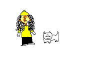
The font at the bottom 'time to pretend' I also made and cut the font myself, I wanted to keep it fairly simple so that the fans can see it straight away, I have also cut it out this way on purpose I think it looks almost childlike and doesn't look overcomplicated. The 'Out Now' font I have decided to keep this yellow in contrast with the green so it will stand out as an advert, the colour yellow also suggests happiness giving off a happy mood. I cut the faces of the bands heads from a photo of them, I chose this image of them because they looked deep in thought and also because I felt black and white was a good effect with weird, colourful images on top of them. The reason for using so many cartoon, animal photos as the song 'time to pretend' mentions animals in the lyrics a lot of times and also the idea of having animals matches in with the theme of letting the mind roam free and fantasy like.
Overall I think the advert is attention grabbing and thought provoking, I think it looks weird but weird in a good way. The number of strange images also attract a wide target audience from children to adults. I think the whole advert reflects fun and happiness and reminds us of childhood and about acting immature this is the reason I have placed a lot of cartoon images and smile images around the page suggesting to the audience that their music is most likely about this. I also liked designing the advert in this way because it is very different and unique from most music adverts I have researched and is not all just about a clique photo shoot of the band.
I think MGMT's song is about escaping from reality and going into your imagination which is the image I'm trying to create and I believe this advert achieves this.

This advert is the last one I have designed, firstly I started off by spalshing paint and using paint tools to create a random effect of pure emotion and craziness, similar to advert number one that is graffiti like. I then placed images of cartoon animals, random objects around the advert to create an effect of being in someones mind and the idea of imgantion taking over in a person's life.
On the left hand side Ive pasted images of money a few times to highlight that celebrities are obesssed with money and the famous lifestyle of being a celebrity, here I have created a sense of irony having the money on the advert.
The first band member was placed in the middle it is from MGMT's photoshoot, I picked this particular picture because of the design on chest and his arms, then on the outside I highlighted the outside of where he was standing by using the paint software airbrush tool. The second member of the band is standing on his right hand side, I didnt want both the members to be standing next to each other so it was like a 'normal' photoshoot

This is the very last magazine advert I have designed, I believe it has the most potential and is the most visually attractive advertisement. I think it conveys exactly what the song is about ( images of animals, childhood) and it is also keeping in with the image that MGMT has of a hippy, psychedelic image.